Idea 1
Beginning
A man being murdered. By a villain/psycho.
Middle
Focus on the family of the victim. they are mourning the loss of there son. Psycho is planning the murder of the rest of the family, has been stalking the family.
End
Find out the killers background motive, the scene where he tries to kill the rest of the family.
Idea 2
Beginning
A CIA agent comes into a school to tell a young lad that his brother has been brutally murdered.
Middle
The man seen in the school being told his brother had been killed is now planning to avenge his brother. he is working for the police doing volunteer work, in an attempt to get closer to the killer.
End
The man has now been trying to catch and kill the murderer for 50years. However one day he comes home to find the man he has been chasing shot in his apartment.
Idea 3
Beginning
Man being stalked through window opposite his house.
Middle
starts walking down the street and drops off some gear. He gets kidnapped and hooded by a white van and taken to a warehouse.
End
The police working on the case find him hanging in a room but manage to bring him back to life but do not manage to find the killer.
Tuesday, 6 December 2011

Sunday, 4 December 2011
Alfred Hitchcock Research

Some of the most well known films Hitchcock was involved in:
Psycho
Rear Window
North By Northwest
He continued to be involved in some great Thriller films and was later named 'The Master Of Suspense'.
Font Research
I wanted to not only research opening titles from well known Thriller films, but also many variations of fonts that we could use for our Thriller opening scene. So I used the website http://www.dafont.com/ to attempt to learn more about how fonts stand out are look effective whilst being linked in with setting the scene.
I found three fonts from different categories on the website, the first one was from the Horror category. It is named 'Face Your Fears'. It is a very common horror-type font, aimed to give the audience a feel of blood and gore and also to build the tension in that the film will may include some disturbing or alarming actions. I think it is very effective because of this because as soon as you see it, you are instantly aware, it in itself begins to set the scene which is exactly what a very good font should do. A example of this is if you look at this exact font and you have never seen it before, ask yourself what film genre you think of, its based for horror/thriller. This is so important to us because if we can find a font that could do this for our Thriller scene it would help us set the scene which is crucial as it is after all the opening scene we are creating, and it must be effective.


I found three fonts from different categories on the website, the first one was from the Horror category. It is named 'Face Your Fears'. It is a very common horror-type font, aimed to give the audience a feel of blood and gore and also to build the tension in that the film will may include some disturbing or alarming actions. I think it is very effective because of this because as soon as you see it, you are instantly aware, it in itself begins to set the scene which is exactly what a very good font should do. A example of this is if you look at this exact font and you have never seen it before, ask yourself what film genre you think of, its based for horror/thriller. This is so important to us because if we can find a font that could do this for our Thriller scene it would help us set the scene which is crucial as it is after all the opening scene we are creating, and it must be effective.

The second font was from the category Comic, it is labelled 'Badaboom'. The reason i wanted to include this font and others from not such a horror/thriller type category is try and find out other features, such as which stand out more, which are more eye-catching. There is no doubt that this font is more bold, more loud and more sort of in your face. It does definitely stand out, but does it stand out more than the 'Face Your Fears' font? The reason I want to argue this is because although the 'Badaboom' font is much more bold and loud, is it more eye catching than the other. It is a very used font, or at least a very common looking font this means yes it is bold it does stand out but maybe it is better for us to go with a more under used font that will easily fit in with the screenplay and set the scene.

The final font I looked at is titled 'Birth Of A Hero'. This font is very interesting as could be used in many film genres, it is a very versatile font which may not be a bad thing. I think that there is no doubt it does not stand out as much as the other to fonts, however it is a very intriguing font as it has a lot going on within it. The wording in the font seems to be almost shattering away or breaking off, this is interesting as it could be used to relate to a specific feature within the opening scene. For example if the opening scene was of a abandoned rough neighbourhood, this font could go perfectly and fit it just like the 'Face Your Fears' font in setting the scene. I think that if we chose a font like this one it would be important to try and fit it in some how with what the opening scene is about to make the scene more effective and to create a unique Thriller opening.

From researching these fonts I have realised the importance they have, that to create an effective opening Thriller scene, we must firstly find a font that is eye-catching and stands out, and secondly incorporate it into the opening scene to not only be very eye-pleasing but also help set the scene itself.
Opening Titles Analysis (Panic Room)

I wanted to do as much research as I could for opening titles, simply because i want to learn and understand how to create such unique and effective looking opening credits. The reason being that i feel they are a very key element in the opening scene of a film as they are the opening to a film, the first part judged, and if they are not pleasing then they are not good enough.
To research the opening titles for this Thriller film i used the website http://www.artofthetitle.com/ it helped me view the opening credits and really get a grip on how they were intended to be portrayed to the audience.
Panic Room opening with the trademark Columbia opening sequence, however one thing that was changed was the music that goes with this sequence. It is replaced with much more alarming sounds, like thunder and lightning. Then it fades to black and the very first thing heard is police sirens, straight away give the audience a sense of suspense and tension. As the colour fades back in, it reveals a establishing shot, displaying the city with the first line of text over it. The font is a fairly bold silver font, it also includes a sense of 3D to it to help it clearly stand out from all the other colours in the city scene background. Many jump cuts are used to switch to a different set of buildings with a different title over it, whether it be main actors of big companies involved. Throughout all this time the sounds being emitted consist of traffic and the normal sounds heard in a city, also very high string music that is commonly associated with Thriller films. Eventually a pan shot is used to reveal the title as it pans, this changes from the normal more still image like shots. Another feature I think is important to point out is the angles of the shots. This is done very effectively, if it is a high angle shot of the buildings, the text over the top will also be in the same position, this helps really link the titles in with the surroundings making it not only more creative but eye-pleasing. The sounds do change as the opening credits continue, when the title of the film 'Panic Room' is displayed in a more bolder and larger font the high string music increases in tempo and adds in new 'on edge' sounds, this is an attempt to help begin the suspense that is so renowned for Thrillers.
I think what we can learn from the opening titles from the film Panic Room is that we can try to incorporate them into the surroundings but at the same time make them sufficiently stand out. This would be good as it brings the titles and the scene together to help set the scene instead of both, titles and scene being nothing alike and in no real way linked and therefore not creating a simple yet effective opening title sequence.
Analysing first 5 minutes of Die Hard 4.0
This film came on while i was watching TV. At first i had thought that die hard was merely an action film but after watching the first 5 minutes of this film it had me wanting to watch all of it. This is a thriller due to the fact that there are multiple jump cuts. This was used to show different people in different places whilst not revealing much about them. This is something that we could do for our thriller opening. This technique is very effective as it tells the audience that they are doing something which they shouldn't be. Probably something to do with government papers as they are getting through firewalls and passwords. It lest the audience have make conclusions from a very short bit of the film.

After a conversation between the head of FBI and a lower ranking female in the middle of the pentagon an establishing shot is used to focus on a car. When soon the main character, who is Bruce Willis, pulls someone out of the car and an argument begins. During the credits something of importance is happening but the audience do not find out a lot about it. when the credits are over a new scene begins but its different. these are all things that we could use in out thriller opening.

After a conversation between the head of FBI and a lower ranking female in the middle of the pentagon an establishing shot is used to focus on a car. When soon the main character, who is Bruce Willis, pulls someone out of the car and an argument begins. During the credits something of importance is happening but the audience do not find out a lot about it. when the credits are over a new scene begins but its different. these are all things that we could use in out thriller opening.
Saturday, 3 December 2011
Character types research
 Some common character types in a thriller are superheroes,detectives, supernatural children and animals, attractive females and insane villains.
Supernatural children and animals these are people/ animals with unexplained powers. The supernatural force is normally threatening, and sometimes mystery to be solved such as Sixth sense, Jaws and The orphan.
Detectives are normally the protagonist in thrillers they are typically someone connected to the law. They rely on the their knowledge to capture the villain. For example Holmes and Bond.
 Attractive females are characters which are irresistible and lead the hero's into danger.
Superheroes are fictional characters with superhuman powers. They show alter egos, special powers and secret lairs. They normally have people who despise them and try to humiliate them. For example Superman, Batman and Watchman.
Insane villains are marked by insanity but also pure brilliance they are connected to insane asylums and hospitals for example the Joker from batman and The shining.
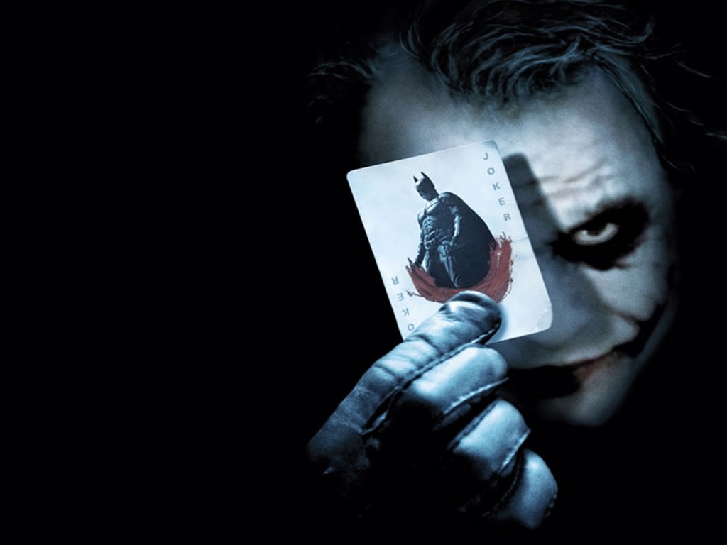
Thursday, 1 December 2011
Opening Titles Analysis (North By Northwest)
 The film North By Northwest has a very intriguing and eye-catching opening title sequence, I want to analyse the opening titles and see how they use backdrops and fonts to create such a unique opening title scene.
http://www.youtube.com/watch?v=jIlqatMQSgI
The titles open as a bright green backdrop with multiple black lines feeding in from different angles, these black lines then cross each other and make a patterned background that is later very effectively used to fade in the scene. The text is white to stand out over the green background and the font is fairly bold, not italic or unordinary, just white and clear. This looks quite pleasing to the eye as it is easy to read, and is bought in with a simple swipe in animation. The titles consist of firstly companies involved then main actors, then says 'in Alfred Hitchcock's, North By Northwest'. There is arrows on the text of the title, 'North By Northwest', this could be to give it some kind of uniqueness from the other text and to show it is important and needs to stand out from the rest. What happens next is very effective, the white text disappears and the green backdrop dissolves revealing the side of a corporate looking building of a big business. This is done so effectively because although the green backdrop dissolves out of the shot, the original black crossing lines stay and are lines in the building.


This is a very effective change to cut into a city scene, you can see the moving cars on the busy road in the reflection of the building. Then eventually the shot dissolves again into a set of various different scenes that are displaying a busy road/street/building. This helps set the scene whilst showing the opening credits which is something that is very important in a film. The sounds used in the opening titles are very high string sounds which contribute to the Thriller scene, as they are very renowned sounds for Thriller films, to build tension, suspense or even in this case to set the scene.
I think we should involve elements like the ones used in this films opening titles to help create effective and eye-pleasing opening titles for our Thriller scene. We could take the idea of attempting to set the scene whilst displaying our opening credits, this will help our opening scene flow well and have a good Thriller scene set before any real video screenplay begins.
Subscribe to:
Posts (Atom)